Advanced Typography | Final Project

28/10/19- 18/11/19 (Week 10 - Week 13 )
Yeo Ava (0340222)
Advanced Typography
Final Project
Lecture
Instructions
Lecture
Instructions
FINAL PROJECT
Idea Proposal
Idea #1
Idea : My initial idea was to create a greeting card representing the Dayaks in Sarawak. I wanted to use the technique "Kirigami" to create the greeting card.
Purpose : To introduce and promote the culture to others.
 |
| Fig 1.1 Reference |
 |
| Fig 1.2 Reference |
Idea #2
Idea : To redesign the logo of the "Visit Sarawak" campaign.
Purpose : To create a more attractive and modern logo that represents Sarawak in a different way.
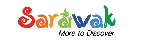 |
| Fig 1.3 Original logo of "Visit Sarawak" campaign |
Mr Vinod approved the second idea and suggested me to make a set of typeface that will be used during an event in Sarawak, like a official typeface for Sarawak tourism. Mr Shamsul and Mr Vinod told me to look into the "Rio 2016" typeface for reference.
Designing
At first i thought of making a logo that overlaps and with a textured hand lettering brush.
 |
| Fig 1.4 rough sketches on Procreate |
After trying it out , I thought it didn't look right so I decided to do more research.
Sarawak's population is very diverse, comprising many races and ethnic groups. Sarawak has more than 40 sub-ethnic groups, each with its own distinct language, culture and lifestyle. This makes Sarawak demography very distinct and unique compared to its Peninsular counterpart.
 |
| Fig 1.5 Population of Sarawak |
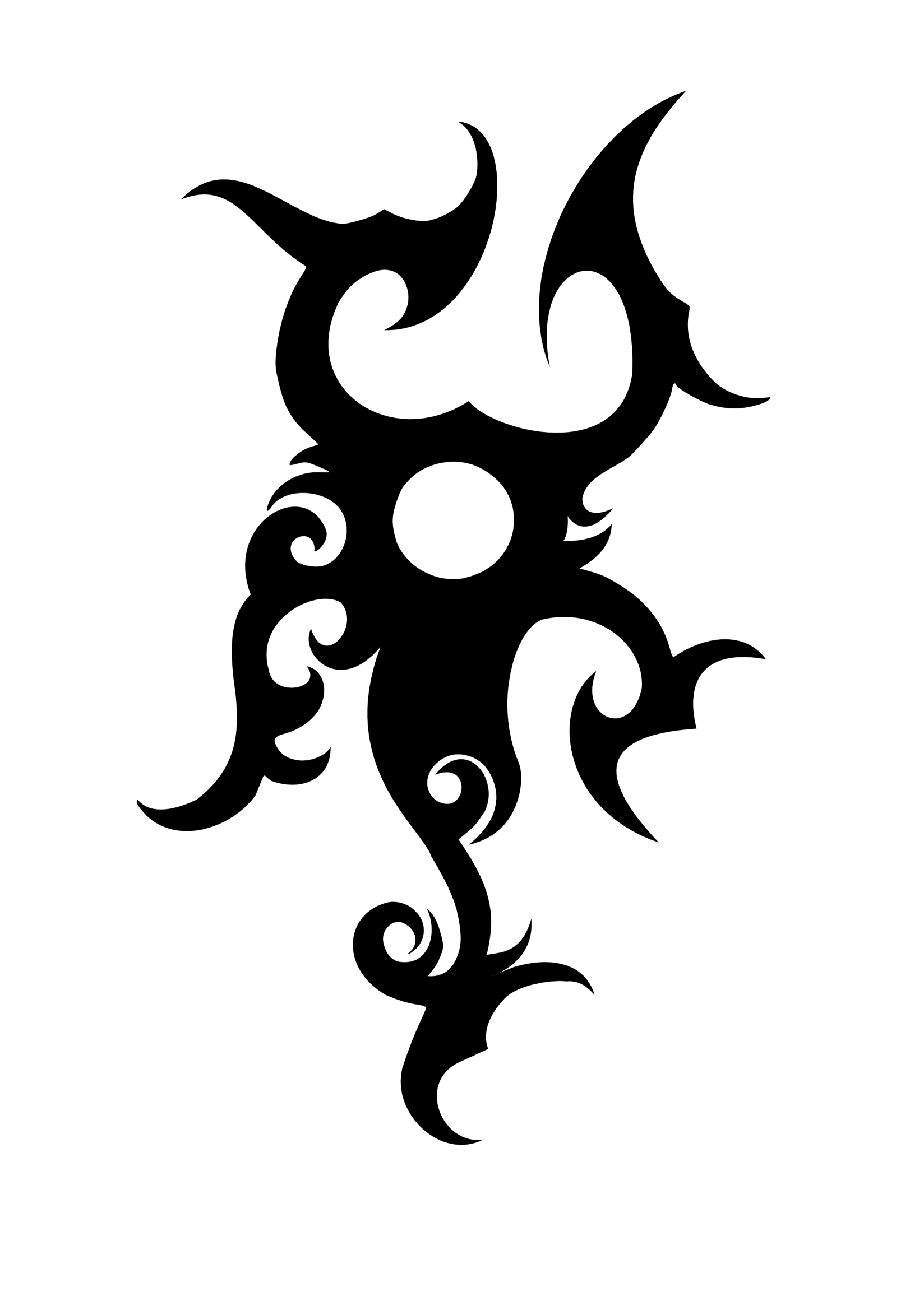 |
| Fig 1.6 Example of an Iban tattoo art |
 |
| Fig 1.7 The iconic Iban Bunga Terung tattoo |
The traditional Bunga Terung tattoo has such a deep meaning behind it; 1) One on each shoulder for the ‘Berjalai’ journey to make you stronger to carry your travelling pack, 2) Protection, and 3) the centre coil to symbolise the transformation from a tadpole (young man) to maturity.
After researching, I've decided to incorporate the "Bunga Terung" and a part of the Iban tattoo together to make a symbol. I then tried to write a set of alphabets with a smooth brush this time and try to mask the symbol into the alphabets
 |
| Fig 1.8 First attempt (Smooth brush and symbol) |
 |
| Fig 1.9 Symbol on existing font done in Procreate |
It didn't came out as I've imagined so I tried again, but this time with a "Chalk" calligraphy brush on Procreate.
(Second Attempt)
After lots of researching and referencing online, I've decided to start fresh and reset my concept. I still want to keep the symbol as the logo. Following is a few attempts I did and I also played with colours and different phrases to see if it works.
I've decided to try the hand-lettering cursive again, as I am more confident with it.
 |
| Fig 1. 10 Reference |
 |
| Fig 1. 11 Third Attempt (Smooth Brush, Cursive) |
 |
| Fig 1. 12 Third Attempt (Smooth Brush, Cursive) |
And I've also created a set of san serif uppercase typeface on Procreate for the tagline.
At this point I was still not satisfied with my work because it didn't represent Sarawak enough. So I've decided to brainstorm with a fellow Sarawakian friend and ask about his opinion.
Below is a short-clip of my brainstorming on Procreate.
After that brainstorming session, I've decided to stick with the hand-lettering cursive font and use a textured brush called "Shale Brush" on Procreate.
The brush has a wood texture feel - Sarawak is known for the rugged, dense rainforest of its interior, much of it protected parkland.
The cursive hand-lettering joining together - Sarawak's population is very diverse, compromising many races and ethnic groups, but unity is well practiced in Sarawak.
I realised that I have to create a set of alphabets first then I can create the logo or else it'll look different. I've decided to trace over an existing typefaces to make it more accurate and consistent.
 |
| Fig 1.13 Fourth Attempt (Lowercase, Textured Brush, Cursive) |
 |
| Fig 1.14 Fourth Attempt (Uppercase, Textured Brush, Cursive) |
After the fourth attempt, I decided to attempt another time but with a different kind of typeface.
 |
Fig 1.15 Fifth Attempt (Lowercase, Textured Brush, Cursive) |
 | |
|
I then proceed to covert my file into an Adobe Illustrator file and edit it in FontLab VI
 |
| Fig 1.17 Editing on FontLab VI |
 |
| Fig 1.18 Editing on FontLab VI |
 |
| Fig 1.19 Progress on Adobe Illustrator |
 |
| Fig 1.20 Attempt of Logo |
 |
| Fig 1.21 Uppercase |
 |
| Fig 1.22 Lowercase |
Application :
For application, I've decided to make a simple ad campaign focus on the famous tourist spot in Sarawak.
 | ||||
Fig 1.23 Website
|


Second attempt of applications :
 |
| Fig 1. 26 Application Second Attempt #1 |
 |
| Fig 1. 27 Application Second Attempt #2 |
 |
| Fig 1. 28 Application Second Attempt #3 |
 |
| Fig 1. 29 Application Second Attempt #4 |
 |
| Fig 1. 30 Application Second Attempt #5 |
 |
| Fig 1. 31 Application Second Attempt #6 |
 |
| Fig 1. 32 Application Second Attempt #7 |
 |
| Fig 1. 33 Application Second Attempt #8 |
 |
| Fig 1. 34 Application Second Attempt #9 |
 |
| Fig 1. 35 Application Second Attempt #10 |
Feedbacks
Week 10 (28.10.19)
Deepavali Holiday
Week 11 (04.11.19)
General Feedback Make sure that our blog is neat and up-to-date Feedback Mr Vinod said that not many people buys a greeting card nowadays, so I've decided to create a set of typeface for Sarawak and recreate the logo of the Sarawak tourism logo.
Week 12 (11.11.19)
Feedback Mr Vinod and Mr Shamsul asked me to reference the logo and typeface of the Rio 2016 . That should be my refence and path on continuing my typeface and logo design. The typeface and logo should look similar but different at the same time.
Week 13 (18.11.19)
Feedback
Change the application image to monotone so that my typeface stand out. Make it like a headline poster.
Week 10
Class got cancelled due to Deepavali. I was happy but also trying very hard to come up with an idea for my final project.
Week 11
When I told Mr Vinod and Mr Shamsul my idea, I was nervous as I am not sure if I was going towards the right direction. After some guidance, I felt more confident.
Week 12
After a few attempts of trial and error, I've decided to do more research on Sarawak culture. I wanted to write in cursive as I'm confident in it.
Week 13
Today was the submission of our final project. I only slept for 2 hours last night and I was weirdly energised. Maybe it's the feeling of relief as I didn't have to amend much stuff for this final project.
Week 10
Class got cancelled due to Deepavali.
Week 11
I realised that some of my classmates were going towards the experimental typography direction. I also noticed that some of my classmates were doing something similar to mine, which is culture related.
Week 12
Everyone was very focused on their work today, and asking as many feedbacks as they can.
Week 13
Most of my classmates have to amend most of their final project design. And the atmosphere was tense as everyone's asking each other how is their feedback from Mr Vinod and Mr Shamsul. Most of my classmates couldn't export their typeface on FontLab Trial and they have to go to the Mac lab to export their typeface.
Findings
Week 10
Class got cancelled due to Deepavali.
Week 11
I found out that it was not easy to come up with an idea without any research.
Week 12
I found out that I could continue my second attempt as it is too messy and I also didn't like it. Mr Shamsul's and Mr Vinod's suggestion on referencing the "Rio 2016" typeface really helped.
Week 13
I found out that there's only one week left till this semester ends and the chasing deadlines will eventually come to an end soon.
Further Reading
1. Velasco, C., Woods, A. T., Hyndman, S., & Spence, C. (2015). The taste of typeface. i-Perception, 6(4), 2041669515593040.
The study, investigates whether there is a semiotic relationship between basic taste words - sweet, sour, salty, and bitter, along with the form of typefaces in terms of roundness or angularity. Throughout this paper, it is clear that the researchers have carried out thorough research by referencing other tools and relevant materials, as well as an analytical approach to this analysis.
Deepavali Holiday
Week 11 (04.11.19)
General Feedback Make sure that our blog is neat and up-to-date Feedback Mr Vinod said that not many people buys a greeting card nowadays, so I've decided to create a set of typeface for Sarawak and recreate the logo of the Sarawak tourism logo.
Week 12 (11.11.19)
Feedback Mr Vinod and Mr Shamsul asked me to reference the logo and typeface of the Rio 2016 . That should be my refence and path on continuing my typeface and logo design. The typeface and logo should look similar but different at the same time.
Week 13 (18.11.19)
Feedback
Change the application image to monotone so that my typeface stand out. Make it like a headline poster.
Reflection
Experiences
Week 10
Class got cancelled due to Deepavali. I was happy but also trying very hard to come up with an idea for my final project.
Week 11
When I told Mr Vinod and Mr Shamsul my idea, I was nervous as I am not sure if I was going towards the right direction. After some guidance, I felt more confident.
Week 12
After a few attempts of trial and error, I've decided to do more research on Sarawak culture. I wanted to write in cursive as I'm confident in it.
Week 13
Today was the submission of our final project. I only slept for 2 hours last night and I was weirdly energised. Maybe it's the feeling of relief as I didn't have to amend much stuff for this final project.
Observations
Week 10
Class got cancelled due to Deepavali.
Week 11
I realised that some of my classmates were going towards the experimental typography direction. I also noticed that some of my classmates were doing something similar to mine, which is culture related.
Week 12
Everyone was very focused on their work today, and asking as many feedbacks as they can.
Week 13
Most of my classmates have to amend most of their final project design. And the atmosphere was tense as everyone's asking each other how is their feedback from Mr Vinod and Mr Shamsul. Most of my classmates couldn't export their typeface on FontLab Trial and they have to go to the Mac lab to export their typeface.
Findings
Week 10
Class got cancelled due to Deepavali.
Week 11
I found out that it was not easy to come up with an idea without any research.
Week 12
I found out that I could continue my second attempt as it is too messy and I also didn't like it. Mr Shamsul's and Mr Vinod's suggestion on referencing the "Rio 2016" typeface really helped.
Week 13
I found out that there's only one week left till this semester ends and the chasing deadlines will eventually come to an end soon.
Further Reading
1. Velasco, C., Woods, A. T., Hyndman, S., & Spence, C. (2015). The taste of typeface. i-Perception, 6(4), 2041669515593040.
The study, investigates whether there is a semiotic relationship between basic taste words - sweet, sour, salty, and bitter, along with the form of typefaces in terms of roundness or angularity. Throughout this paper, it is clear that the researchers have carried out thorough research by referencing other tools and relevant materials, as well as an analytical approach to this analysis.
In short, the results showed a clear distinction between round and angular typefaces, with the latter being more liked, and associated with sweet compared to the latter, which was less liked and associated with the other tastes-sour, salty, and bitter. The analysis thus supports both the authors ' hypothesis and the inference suggested. The researchers claimed that testing such a hypothesis with, for instance, flavours or perfumes would be important for future research. Another interesting path for future research, and one that would require the testing of the hypothesis forwarded here, would be to analyse associations of taste or typeface across languages.


Comments
Post a Comment